

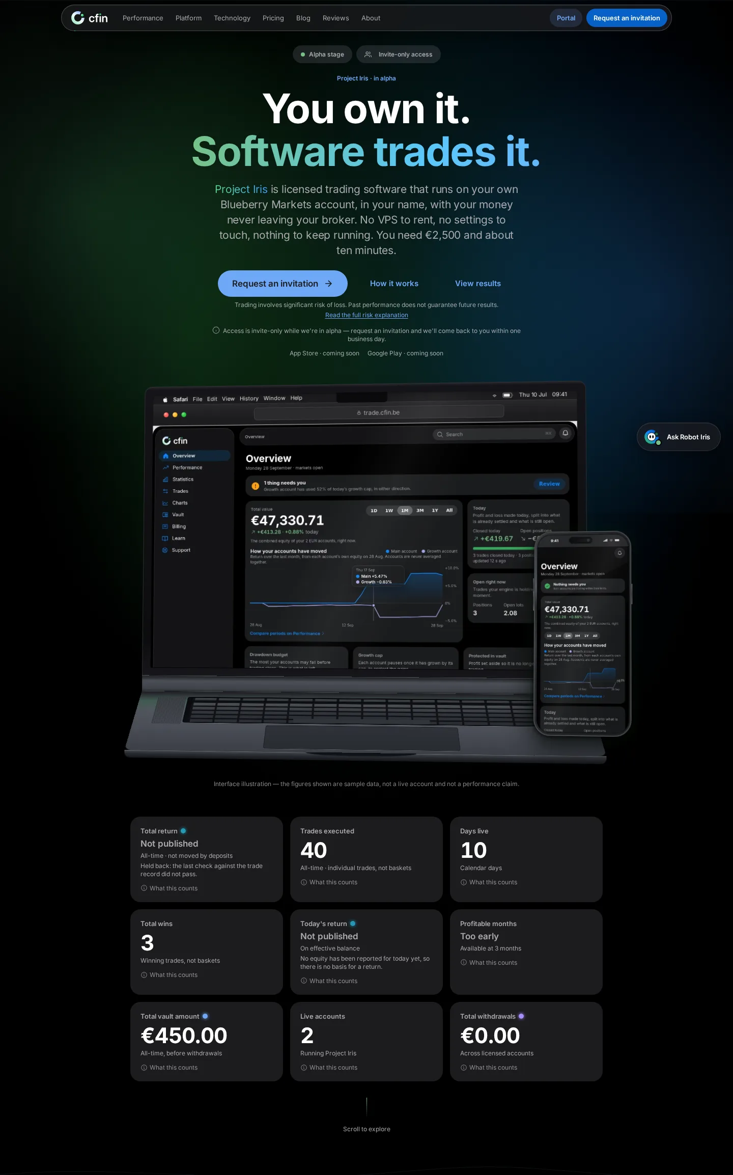
- Rotating headline and key figures restyled with the new type, colour and gradient
- Device mock-ups beside the headline recaptured from the real, redesigned dashboard
- Rotation respects Reduce Motion, settling on one still phrasing
What changed
The top of the homepage still greets visitors with a rotating headline and a row of key figures about the product, chosen once per page load. Both are now styled with the new type and colour system and a subtle gradient.
The device mock-ups beside the headline were recaptured from the real, redesigned dashboard, using a sample account.





Why it matters
The hero section is the first thing most visitors see, so it needed the clearest version of the new look. At the same time, the specific wording and figures are already carefully reviewed and accurate, so we restyled the presentation without rewriting the substance.
What you need to do
Nothing — just visit the homepage to see it.
In detail
- The headline rotates through a small set of pre-approved phrasings, chosen once per page load.
- A row of key figures about the product sits beneath the headline, each pulled from its own live source rather than typed by hand.
- The device mock-ups beside the headline show the real, redesigned dashboard on a sample account.
- A subtle gradient glow behind the hero is the only background effect used on this part of the page.
One more thing
Rotating between a small set of pre-approved headlines, rather than a single fixed line, lets the hero speak to slightly different things CFIN offers without needing a visitor to scroll further to find them.
Every figure shown in this row is pulled live from its real source rather than typed in by hand, so it can never drift out of date the way a hard-coded number eventually would.
We kept the number of rotating phrasings small and all pre-approved, rather than generating text dynamically, so every version a visitor might see has been reviewed the same way as the rest of the page.
We also made sure the rotation itself respects Reduce Motion, settling on a single still phrasing rather than cycling, for anyone who has that setting turned on.