

- New Apple-inspired visual language: type, colour, cards and logo
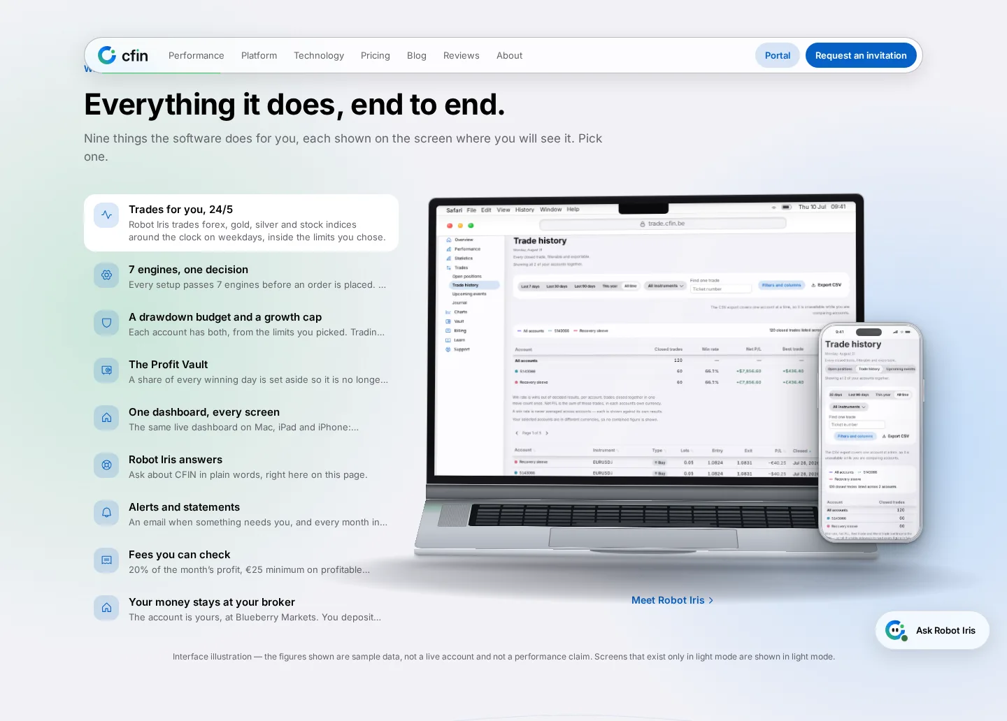
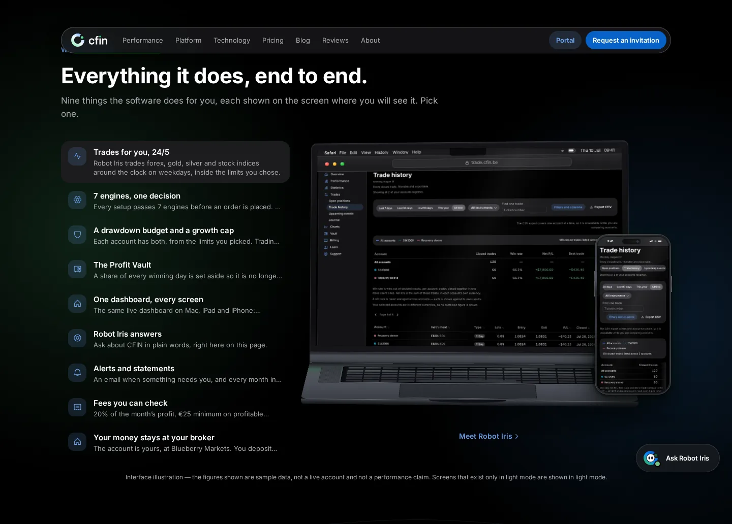
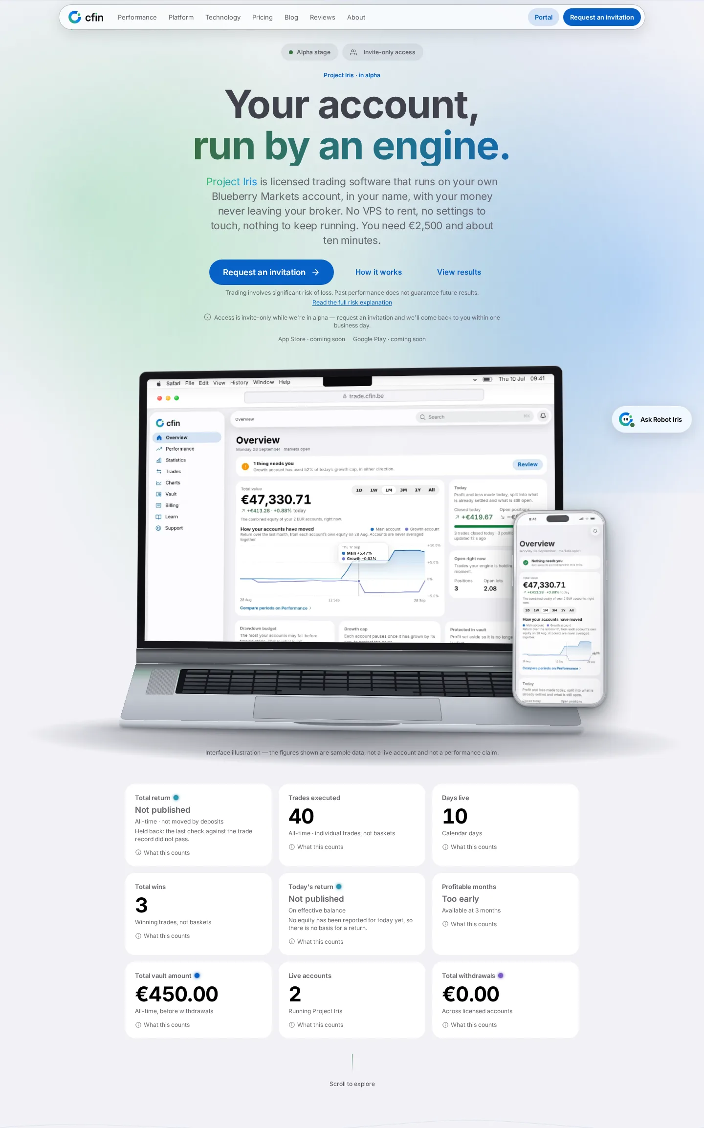
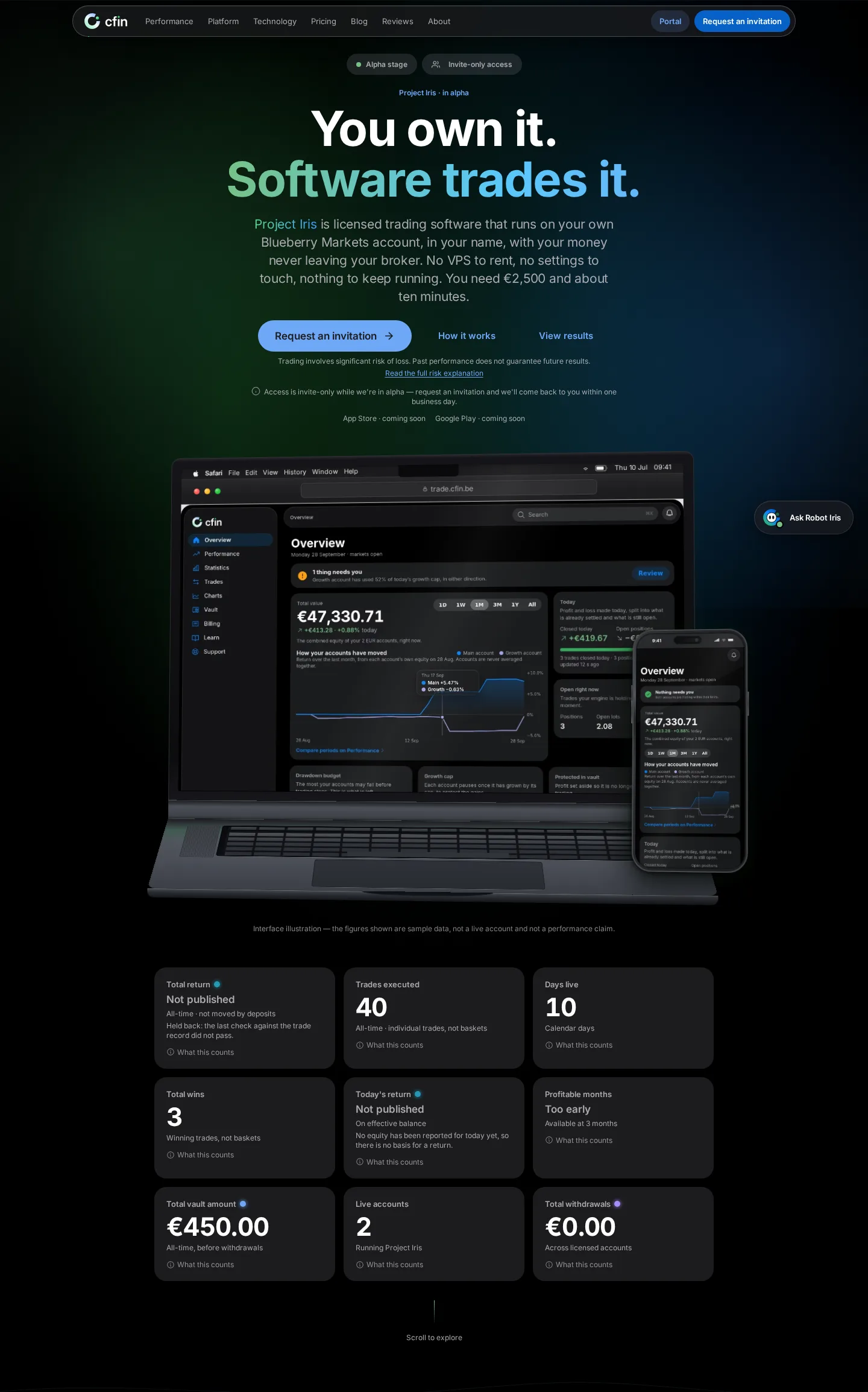
- 3D device mock-ups and scrolling story sections kept, screenshots recaptured from the real redesigned dashboard
- Pricing calculator, FAQ and footer also moved to the new design language
What changed
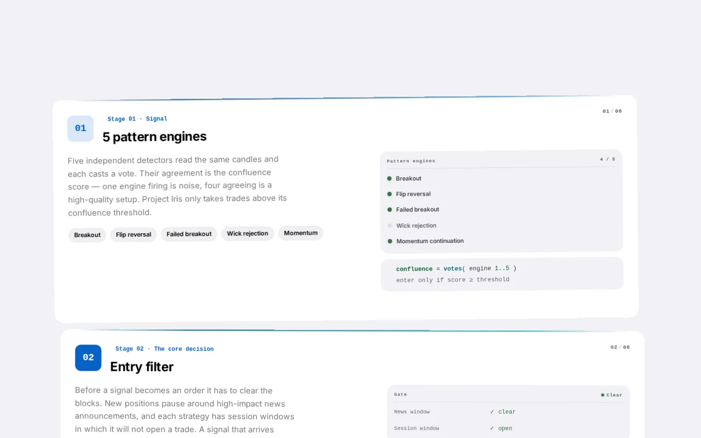
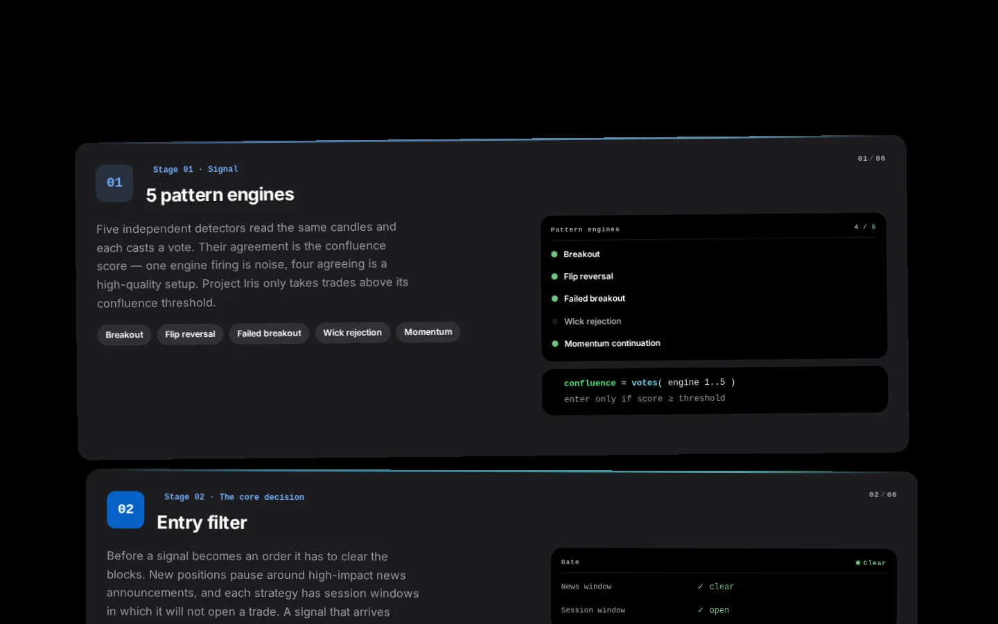
The homepage has been rebuilt in the new Apple-inspired visual language — new type, colour, cards and logo. The structure and motion that customers already recognised were deliberately kept: the realistic 3D device mock-ups showing the real dashboard, and the horizontal and vertical scrolling sections that walk through how the service and the Vault work over time.
Screenshots inside the device mock-ups were recaptured from the actual redesigned product, using a sample demonstration account, so what you see matches the real dashboard.




Why we kept what worked
We heard clearly that the scrolling sections and the realistic device mock-ups were a genuine strength of the old page. Rebuilding them from scratch in a flatter style would have thrown away something that worked well.
The goal was a homepage that looks and feels more premium, without losing what customers already liked.
What you need to do
Nothing — just visit cfin.be. If you're a returning visitor, you should find the page's structure familiar while the finish is noticeably more polished.
In detail
- The 3D MacBook and iPhone device mock-ups were kept, with screenshots recaptured from the real, redesigned dashboard using a sample demonstration account.
- The horizontal and vertical scrolling story sections kept their original scrolling behaviour, restyled with new type and cards.
- The pricing calculator, FAQ and footer all moved to the new design language.
- The alpha/beta banner and the full legal footer — legal line, risk warning, social links, payment chips, language and cookie preferences — remain on every public page.
One more thing
Deciding what to restyle and what to preserve took real discussion: the elements that were kept had already proven themselves effective at explaining CFIN clearly to a first-time visitor. Redesigning them purely for the sake of novelty would have risked losing that.
The result is a homepage that should feel familiar in its structure to a returning visitor straight away, while looking and feeling noticeably more considered and complete.