

- Pinned, sideways-scrubbing scroll section kept exactly as before
- Cards now use flat styling with the new logo and typography
- Section works the same way on mobile, adapted for touch scrolling
What changed
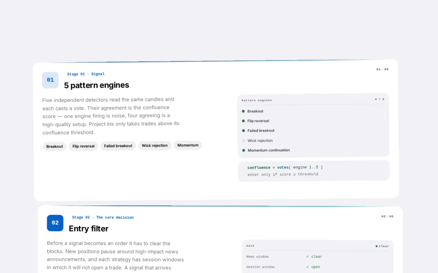
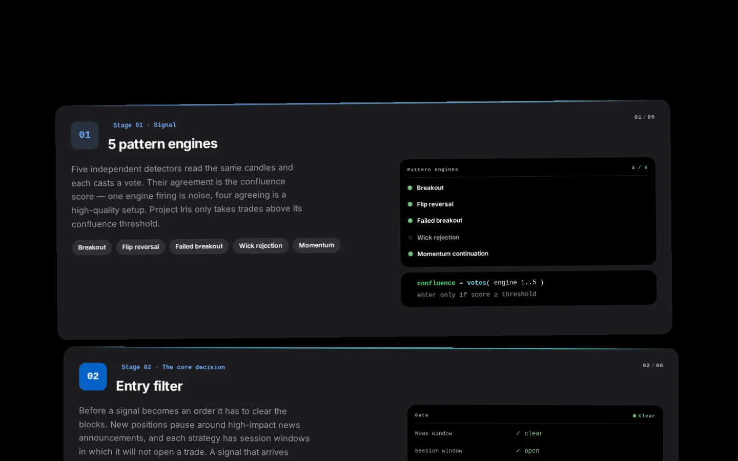
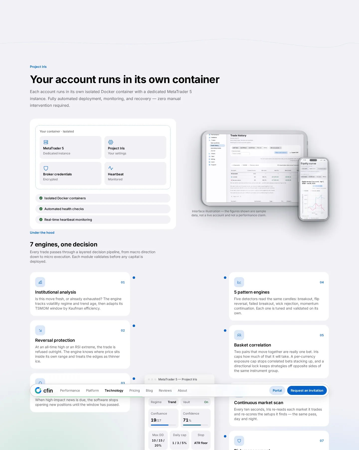
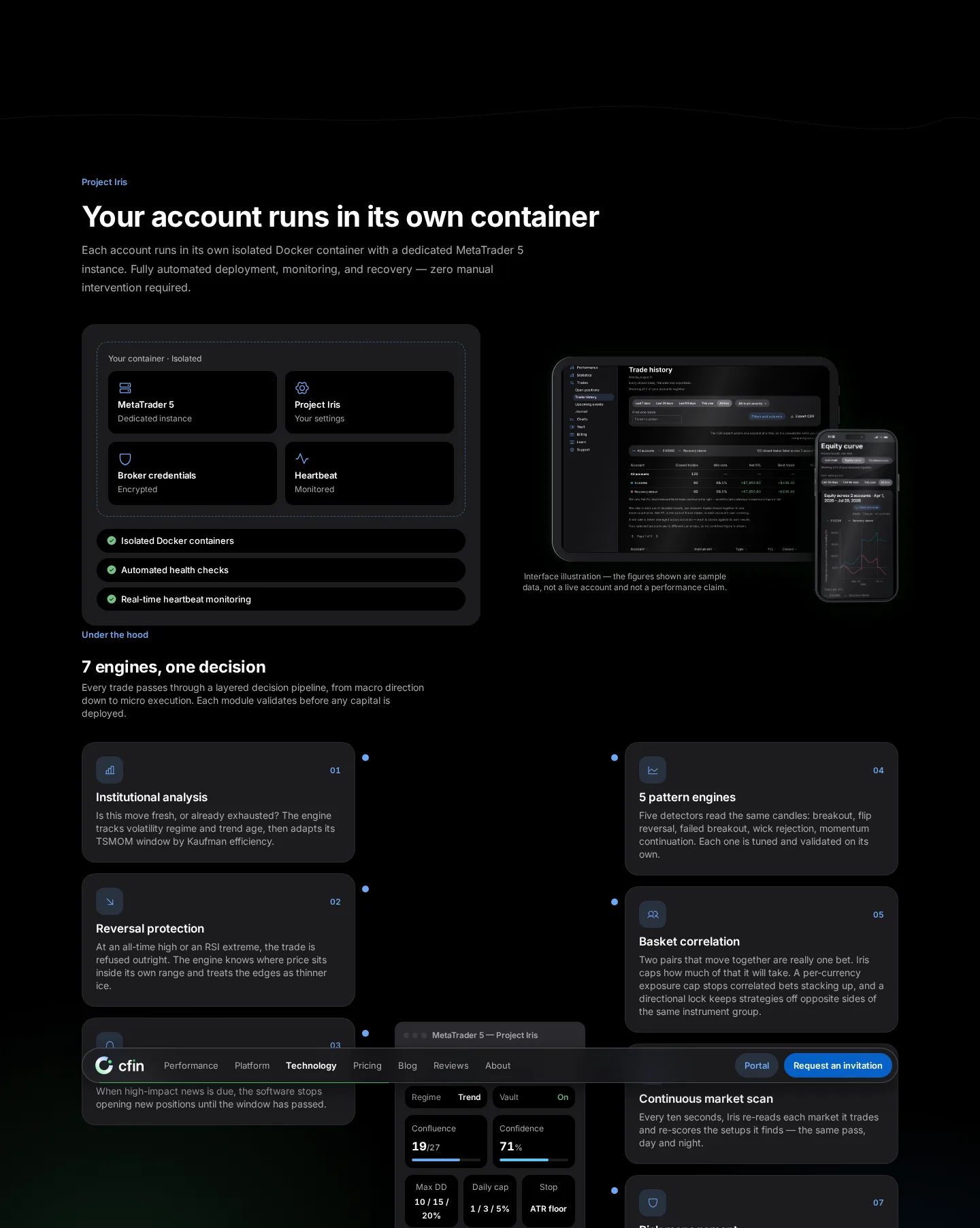
As you scroll down the homepage, a horizontal section pins in place and scrubs sideways through several cards describing how the service works, stage by stage. That pinned, scrubbing behaviour is unchanged from before.
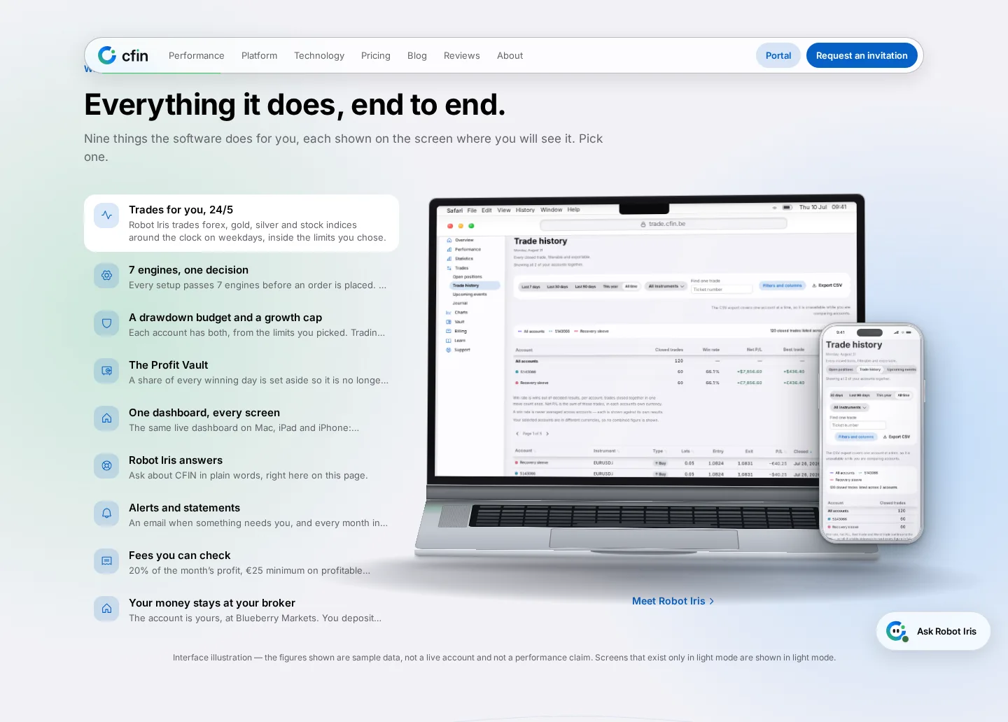
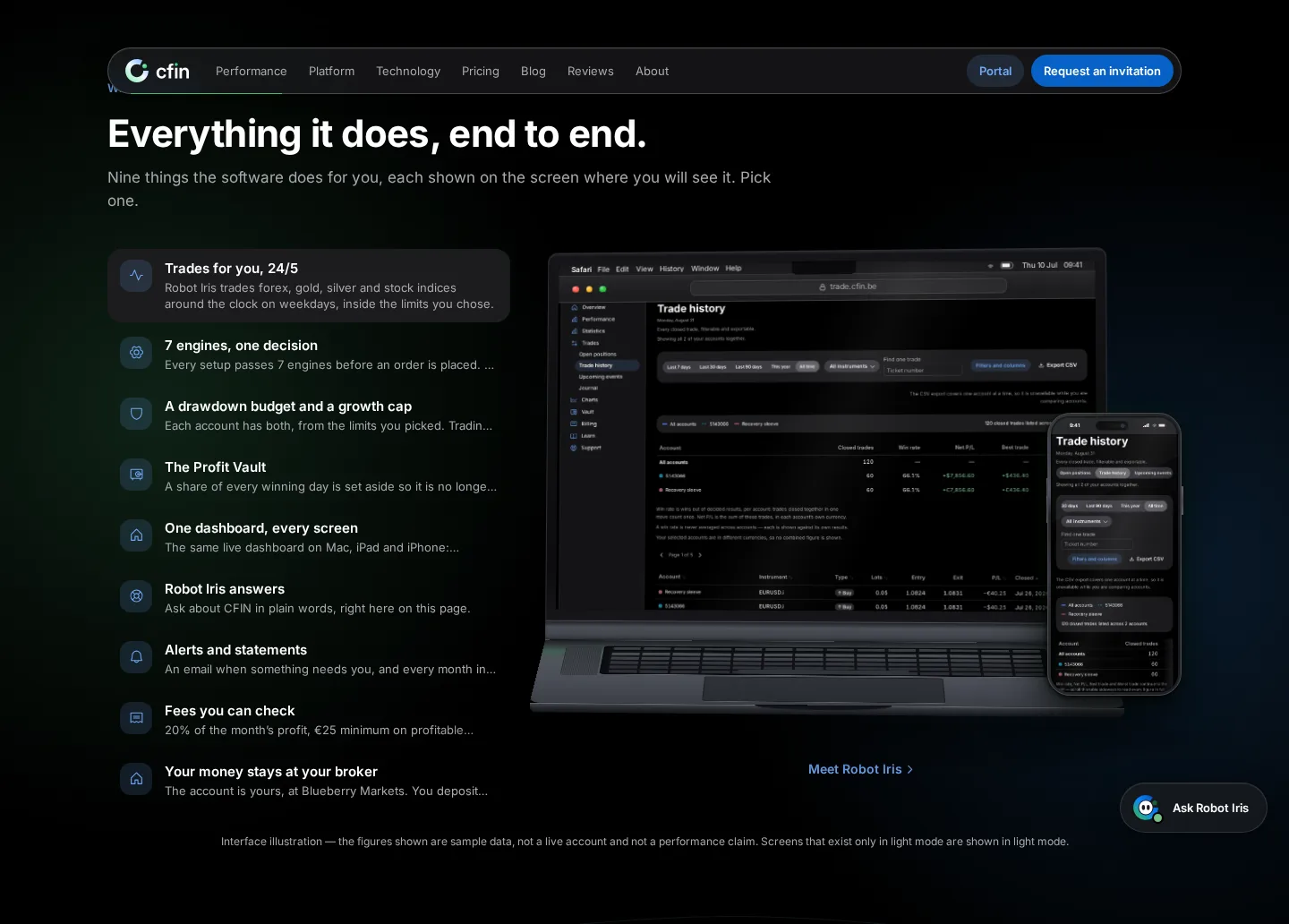
What's new is the type, colour, card style and logo used inside it.




Why we kept the mechanics
This section was one of the more distinctive and well-liked parts of the old homepage. The goal here was specifically to keep the mechanics intact and only refresh the surface, rather than redesign the interaction itself.
What you need to do
Nothing — scroll through it on cfin.be to see the refreshed version.
In detail
- As you scroll, the section pins in place and scrubs sideways through a short sequence of cards explaining how the service works.
- The pinning and scrubbing behaviour itself is unchanged from the previous homepage.
- Cards now use flat styling with the new logo and typography, rather than the earlier look.
- The section works the same way on mobile, adapted for touch scrolling.
One more thing
Keeping the pinned, scrubbing scroll behaviour intact while changing only the visual layer meant the team building this section could focus entirely on getting the new type, colour and card styles right, rather than re-engineering an interaction that was already working well.
If you haven't scrolled through this section in a while, it's worth revisiting — the content explaining how the service works stage by stage is unchanged, but it now looks considerably more polished.
We also checked this section carefully on touch devices, since a pinned, scrubbing scroll interaction that works well with a mouse wheel needs separate attention to feel right under a finger on a phone or tablet.
We paid particular attention to how quickly each card becomes readable as it scrolls into view, since a card that's still fading in when you'd expect to read it feels unfinished even if the content itself is correct.