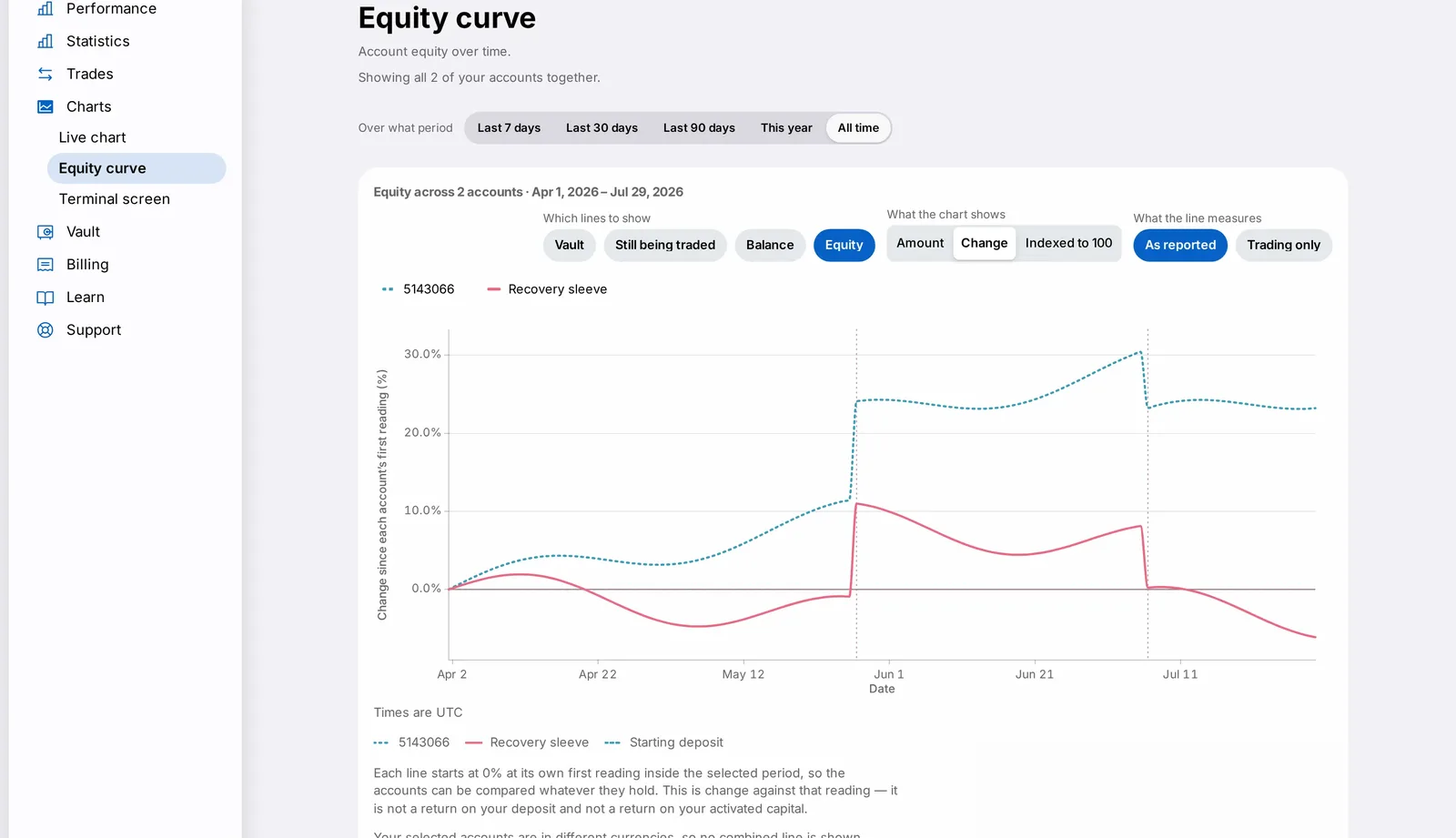
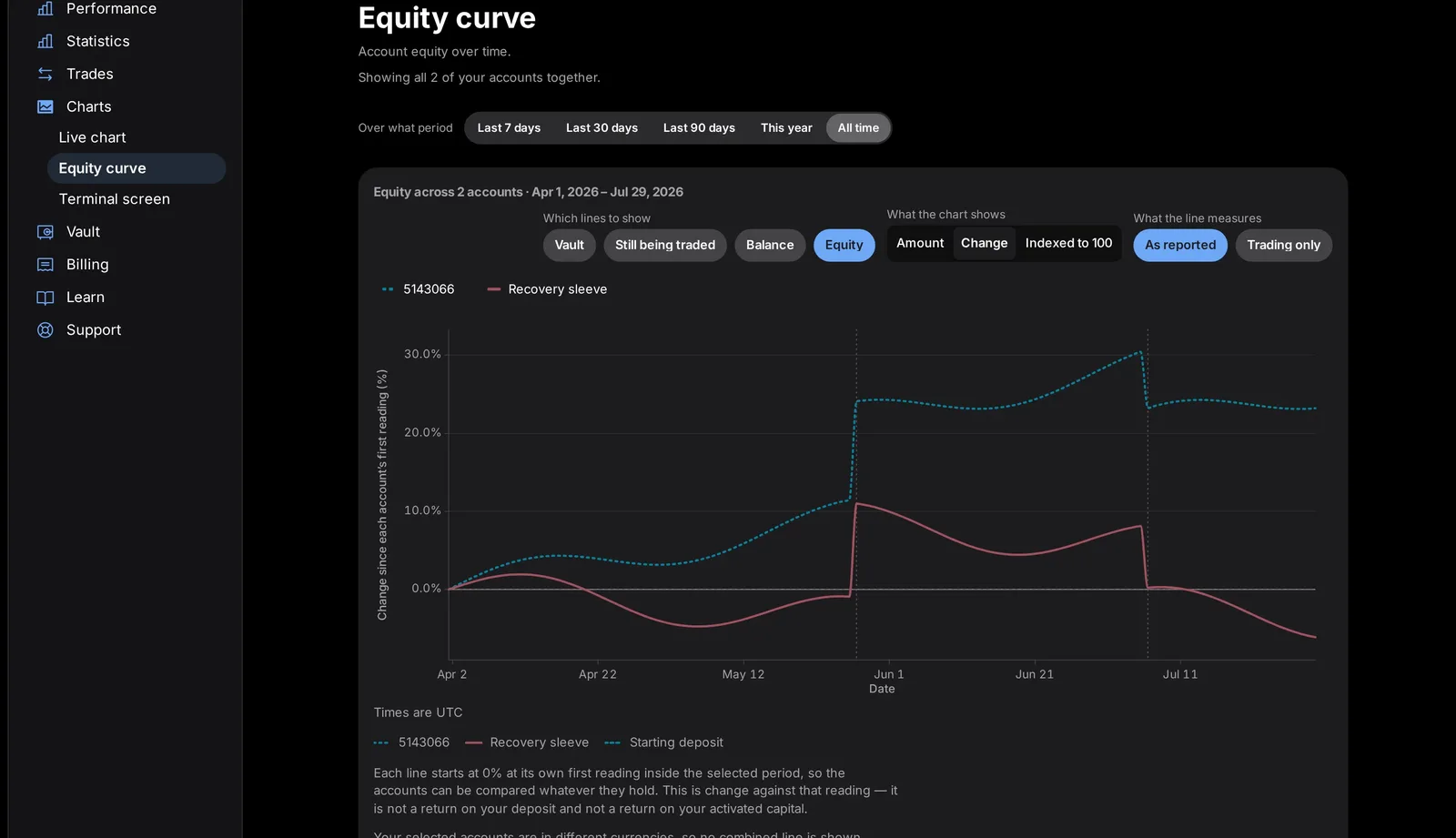
- Summary, Calendar and Distribution rebuilt on the shared card and chart components (Calendar was called Days when this post was first written)
- Consistent loading, empty and error states across all three views
- Account picker appears automatically for multi-currency holders
Updated 11 October 2026. The Days view is now called Calendar, and Performance has gained an Instruments view, which ranks which instruments and engines earn money and which cost money, with the figures behind every bar. Summary shows how your capital has grown over a window you choose, and how your accounts and the CFIN fleet compare on the same axis. Distribution shows how your individual trade results were spread.
On the Performance page, the Summary, Calendar and Distribution views have been rebuilt on the dashboard's shared card and chart components, with consistent loading, empty and error states. This matters because Performance is where you go to understand your account's history, and the three views used to be built differently from each other, which could interrupt that train of thought.
What changed
A clear account picker now appears when you hold accounts in more than one currency. Every figure on the page also carries a short, plain-language explanation of what it represents.


Why it matters
Consistency matters most on a page like this, where you are trying to understand your account's history. Clear labelling and a single, well-explained figure beat a page that tries to show too much at once, or that leaves you guessing what a number means.
What you need to do
If you hold multiple-currency accounts, use the account picker at the top of the page to choose which account's figures you are viewing. CFIN never silently combines figures from accounts in different currencies.
In detail
- Summary, Calendar and Distribution each use the shared chart frame, with the y-axis on the trailing edge and losses shown in grey.
- An account picker appears automatically if you hold accounts in more than one currency.
- Loading, empty and error states are now consistent with the rest of the dashboard, rather than page-specific.
- Every figure carries a short, plain sentence explaining exactly what it represents.
One more thing
Consistency between Summary, Calendar and Distribution matters because customers often move between them while trying to answer one underlying question, and switching between three differently-built pages used to interrupt that train of thought.
If you ever see a figure on this page you do not understand, look for its one-line explanation first; if that still does not answer your question, Support can walk through it with you directly.
We also paid close attention to how this page behaves while data is still loading, since a half-populated chart or a figure that flashes before settling can be more confusing than a short, honest loading state.