- 'Won vs lost' counts individual trade legs; 'Basket win rate' counts each recovery chain once
- Both figures are correct — they simply answer different questions about the same trades
- Both tiles now state their basis directly, next to the figure, including the bar beneath Won vs lost
The landing page now labels two figures that can look, at a glance, like the same statistic — a “Won vs lost” split, and a separate “Basket win rate” — with what each one actually counts. Both tiles sit on the public landing page, and the labelling matters because the two numbers answer different questions about the same trades.
Both figures are correct, and they are deliberately not the same number, because they are counted over two different populations.
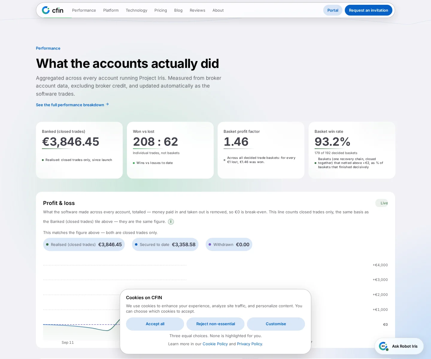




“Won vs lost”: counted per ticket
This figure is a ratio of individual trade legs — every ticket opened and closed, counted on its own. The sublabel underneath it, “Individual trades, not baskets”, exists specifically so this number is not read as a basket-level win rate. The bar beside the figure visualises this exact split, drawn from the same audited per-ticket counts as the number above it — never recomputed from a different source.
“Basket win rate”: counted per basket
A basket, on this page, is one recovery chain — a cluster of related trades on one account, closed together — counted once as a single decided outcome, win or loss, regardless of how many individual legs made it up. The “Basket win rate” figure is the share of decided baskets that closed with a net result above a small threshold, and its own sublabel states the count it is drawn from, for example “X of Y decided baskets”.
The two counts, side by side
A small invented example shows why the numbers differ. Two recovery chains closed today. In the first, three of four tickets won and the chain as a whole made a profit. In the second, one of three tickets won and the chain as a whole made a loss.
chains = [
    {"tickets": ["win", "win", "win", "loss"], "net": +42.0},   # chain A
    {"tickets": ["win", "loss", "loss"],        "net": -18.0},   # chain B
]

tickets = [t for c in chains for t in c["tickets"]]
ticket_wins, ticket_losses = tickets.count("win"), tickets.count("loss")
print(ticket_wins, ticket_losses)        # 4 wins, 3 losses  -> "Won vs lost"

basket_wins   = sum(1 for c in chains if c["net"] > 0)
basket_losses = sum(1 for c in chains if c["net"] < 0)
print(basket_wins, basket_losses)        # 1 win, 1 loss     -> "Basket win rate"
Per ticket it is 4 won and 3 lost (57%). Per basket it is 1 won and 1 lost (50%). Both are correct. They count different things. The real tile also treats a basket that closes within a small threshold of zero as undecided, which this sketch leaves out. The numbers are invented. Past performance is not a reliable indicator of future results.
For reference, the formulas in Learn › Explanations are:
Win rate      = decided wins / (decided wins + decided losses) x 100
Profit factor = gross profit / gross loss
Why both exist
Neither number is more correct than the other; they are simply different units. A fleet can show a strong per-ticket split while a harder basket or two drags the basket-level rate down, or the reverse, and only showing one of the two would hide half of that picture. Keeping both, each clearly labelled with its own basis, lets a reader see the shape of the outcomes at both levels rather than one blended figure that quietly picks a side.
Basket profit factor
A third, related figure — “Basket profit factor” — sits nearby, expressing gross winning basket profit against gross losing basket profit as a ratio, read as “for every €1 lost, €X was won”. Like the basket win rate, it is a basket-level figure and is labelled as such.
Why this needed stating explicitly
An earlier version of the page named the basis of the headline tiles clearly — “individual trades, not baskets” — but a second, related tile further down the same grid, showing the identical won-versus-lost split as a bar, was missed in that same pass and carried no such label for a time. The underlying value was always correct; what was missing was the sentence telling a reader which population it described, which meant a reader scanning the grid could reasonably assume two labelled-differently tiles nearby were measuring the same thing. Both tiles now state their basis directly, next to the figure, rather than relying on a reader to infer it from context.
How to read the grid
- If a tile's sublabel says “individual trades, not baskets”, it is a per-ticket figure.
- If a tile mentions “baskets” or “decided baskets” directly, it is counted once per recovery chain, not once per ticket.
- The two bases will rarely match exactly, and that is expected — they are answering different questions about the same underlying trades.
These are live, fleet-wide figures that move as trading continues, drawn from broker account data and excluding broker credit. They describe demonstration or real-money accounts in CFIN's own fleet, as disclosed in the banner at the top of every public page, and are not a projection for any individual account.
The bar below the figure
Beneath the “Won vs lost” figure sits a small visual bar, split in proportion to the same per-ticket counts shown above it. It is deliberately not re-drawn from basket-level counts, even though basket figures are available elsewhere on the page — doing so would make the bar stop matching the figure directly above it, recreating the same mismatch this labelling pass was meant to remove, just one level further down.