- iPad-width (roughly 768–1024px) layouts given their own dedicated check
- Fixed a homepage iPhone mockup frame that was rendering past the right edge, invisibly clipped
- Also covered Vault, Learn, Support and the app shell sidebar, in both portrait and landscape
iPad-width viewports sit in an awkward middle ground: too wide for the phone layout, too narrow for the desktop one. Several places on the public site and in the dashboard had, as a result, quietly fallen through the gap between the two — correct at phone width, correct at desktop width, and subtly wrong in between. This pass went through that band specifically, rather than assuming it would be covered by the phone and desktop work either side of it.




The headline example
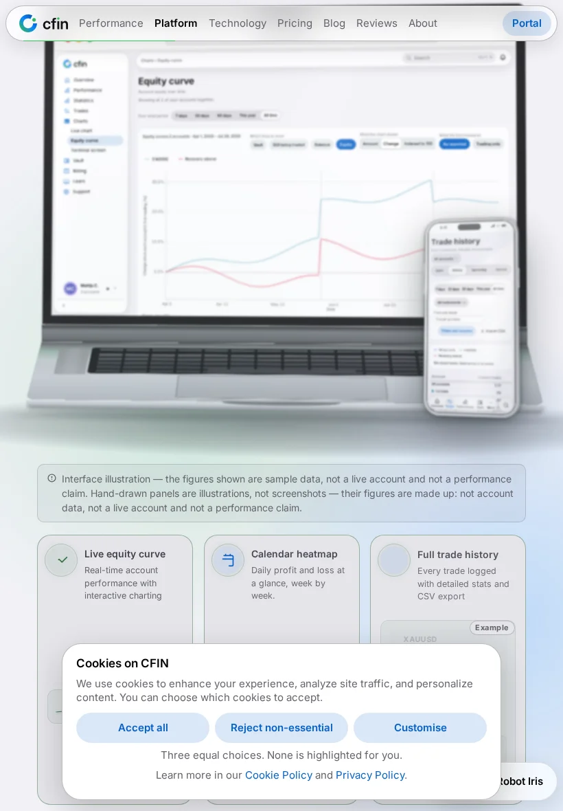
The homepage's device mockup section carries a tilted iPhone frame alongside a MacBook frame. At iPad-portrait width, the iPhone frame's right edge was rendering a short distance past the actual viewport — invisible, silently clipped, rather than visibly broken. Because nothing looked broken, it was easy to miss; it read simply as a missing element rather than an overflow problem. It is now kept inside the viewport across the whole width band between a phone and a desktop, not only at the two ends of that range.
Why this kind of defect is easy to miss
A layout issue that produces a visibly broken page tends to get caught quickly. One that silently clips an element off-screen does not — the page still looks tidy, just missing something, which reads as a content problem rather than a layout one until someone actually measures it at the right width.
Elsewhere this pass covered
- Vault, Learn and Support layouts inside the dashboard, specifically at iPad width.
- Touch-sized sidebar rows and tab-strip spacing in the app shell.
- A skip-link control that needed its own sizing check at this width band.
- Admin-side image and gutter spacing checked at the same iPad width band.
Not a single fix, but a recurring theme across the pass
Rather than one change fixing the whole width band at once, iPad-width work across this period landed as a series of smaller, page-by-page passes — Performance and Statistics, Vault, Support, Learn, and the dashboard shell itself each received their own dedicated iPad-width check, usually as a direct follow-up once the previous one had shipped and a new page's turn came up. That pattern reflects the nature of the underlying problem: a layout rule tuned for one end of a width range and a separate rule tuned for the other do not reliably produce a correct result at every point in between, so each page genuinely needed to be measured at iPad width on its own rather than assumed to inherit a fix from elsewhere.
Both orientations, not just portrait
iPad is unusual among the devices the site supports in that landscape use is genuinely common, not a rare edge case — so checks in this pass covered both iPad portrait and iPad landscape widths rather than treating portrait as the only configuration worth verifying. A fix that held at one orientation but not the other would still have left a visibly broken experience for a meaningful share of iPad visitors.
How to check it yourself
- Open the homepage at roughly 820 by 1180 pixels — iPad portrait — or use your browser's device toolbar set to an iPad.
- Scroll to the device mockup section and confirm both frames sit fully inside the viewport.
- Repeat at iPad landscape width and a couple of points in between, rather than only the exact iPad dimensions.
The underlying lesson from this pass was simple: a width band in between two tested endpoints needs its own check, because a rule tuned for one end and a separate rule tuned for the other do not automatically meet cleanly in the middle.