- Visible focus ring added to interactive controls across the public site and sign-in flow
- Form fields and buttons now built to a 44px minimum height; sign-in and social buttons to 50px pills
- Applies to easy-to-miss controls too: calculator steppers, scenario cards, limits presets, cookie sheet
Two specific accessibility changes ran across the public site and the sign-in flow this pass: a visible focus indicator on interactive controls, and a consistent minimum size for anything you tap or click.




A focus ring you can actually see
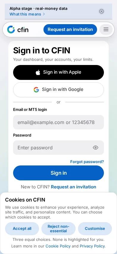
Moving between controls with the Tab key should always show, clearly, which control is currently focused — that is what lets someone navigating by keyboard, rather than a pointer, know where they are on the page. Interactive elements across the public site now carry a visible focus halo when reached this way, rather than relying on a browser default that can be faint or, on some controls, effectively invisible.
44px, as a minimum
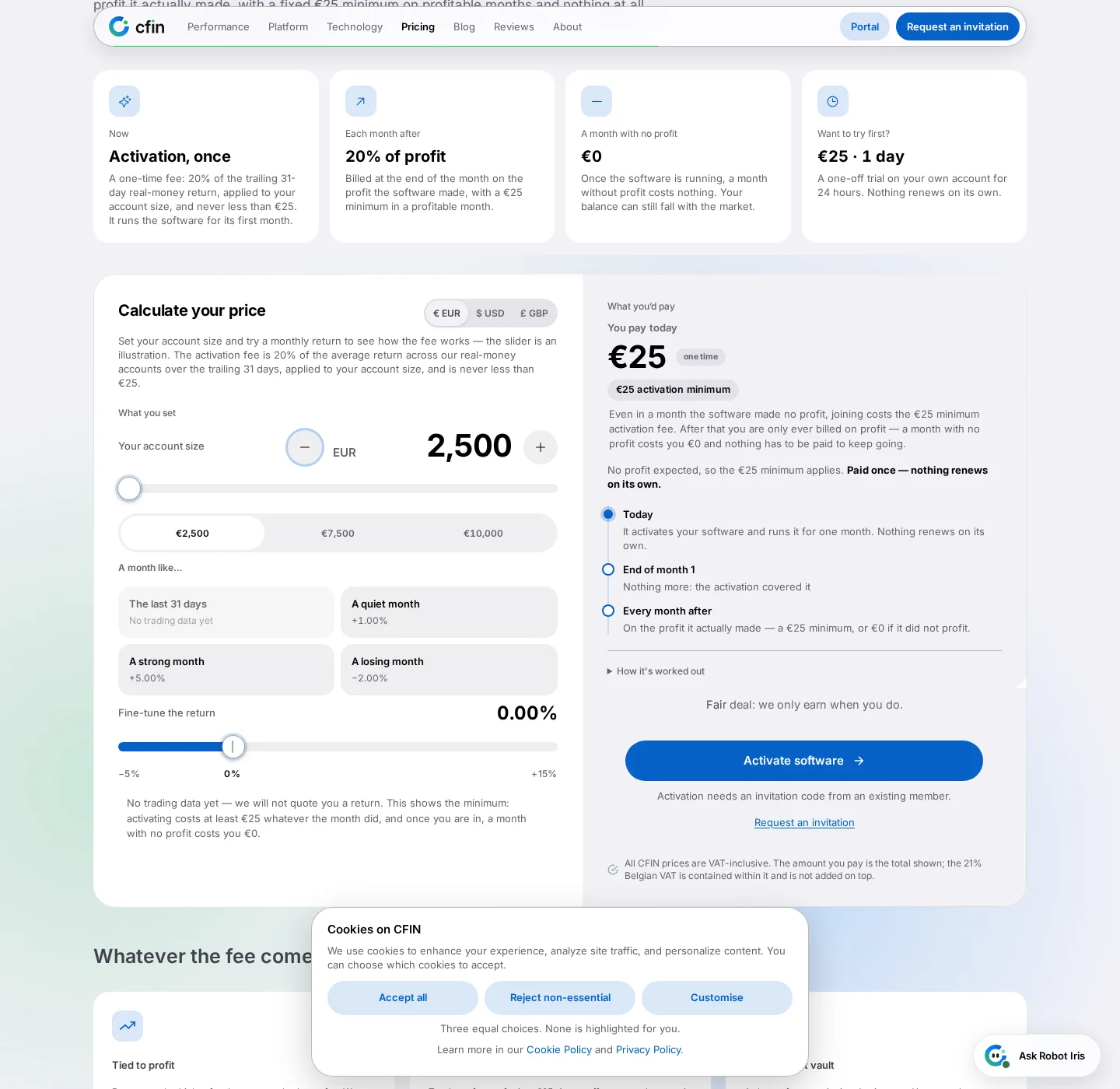
Form fields and primary buttons across the sign-in flow and registration are built to a 44px minimum height, with sign-in and social buttons as 50px pills with deliberate spacing between them. That is not an arbitrary number — it reflects a widely used minimum for a comfortable tap target, and it matters most on exactly the screens most likely to be used on a phone: signing in, and registering.
Why this matters beyond the obvious
A visible focus ring and a comfortably sized target are not only relevant to someone using assistive technology in an obvious, visible way. A focus ring also helps anyone briefly glancing away from the screen find their place again, and a 44px target reduces mis-taps for anyone using a phone one-handed, in a moving vehicle, or simply with larger hands than whatever the original design was tested against.
Consistent across controls, not just the obvious ones
The same focus treatment applies to controls that are easy to overlook in this kind of pass — the plus and minus steppers on the fee calculator, the scenario cards, the segmented limits control's preset buttons, and the cookie sheet's three choices — rather than only the larger, more obviously primary buttons like Sign in or Continue. A control that is easy to miss visually is exactly the kind of control most likely to be reached by keyboard rather than a pointer, which is the reasoning behind covering it here rather than assuming a general page-level style would be enough on its own.
Sizing settled on specific numbers, not a vague “bigger”
Rather than a general instruction to make things larger, this pass settled on specific figures and applied them consistently: 44px as the minimum height for a filled form field, and 50px for a sign-in or social button rendered as a pill, with deliberate spacing between adjacent buttons of that kind rather than them sitting edge to edge. Having an explicit number rather than a looser guideline matters for consistency — it is the difference between “comfortable enough” being decided freshly, and slightly differently, on every page, versus one agreed figure applied the same way everywhere a filled field or a pill button appears.
Why keyboard navigation and touch targets are covered in one post
Focus rings and tap-target sizing address two different groups of people, but they are addressed together here because, in practice, the same screens benefit from both at once: a sign-in or registration flow is used by someone tapping with a thumb, by someone tabbing through with a keyboard, and sometimes by the same person switching between the two mid-task. Treating sizing and focus visibility as one combined pass over the same set of screens, rather than two separate efforts on different timelines, kept both consistent with each other.
Where to check it
- Open the sign-in screen and press Tab repeatedly — each control should show a clear, visible ring as focus moves to it.
- Open the fee calculator and tab through its sliders, steppers and preset buttons.
- On a phone, check that buttons and fields throughout the sign-in and registration flow feel comfortable to tap without zooming in.